Bootstrap Table Tutorial
Introduction
Tables are present in most programs (web, desktop or mobile program) and they are a important component in presenting records to the end user. The HTML tables are actually used to present data in framework method such as rows and columns . With using Bootstrap 4 framework you are able to easily increase the appearance of the table.
These days, with the significance that the user interface has, realising precisely how to enhance the visual appeal of a Bootstrap table comes to be as relevant as it is. In this scenario, one of the technologies that have come to be reference is Bootstrap. This front-end framework, among plenty of other features , provides a variety of elements for styling and optimizing the presentation of various components, such as tables.
Basic table in Bootstrap
To format a table through Bootstrap, just simply add the table class to the
<table>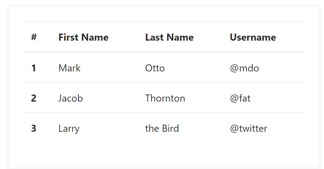
<table class="table">
  <thead>
    <tr>
      <th>#</th>
      <th>First Name</th>
      <th>Last Name</th>
      <th>Username</th>
    </tr>
  </thead>
  <tbody>
    <tr>
      <th scope="row">1</th>
      <td>Mark</td>
      <td>Otto</td>
      <td>@mdo</td>
    </tr>
    <tr>
      <th scope="row">2</th>
      <td>Jacob</td>
      <td>Thornton</td>
      <td>@fat</td>
    </tr>
    <tr>
      <th scope="row">3</th>
      <td>Larry</td>
      <td>the Bird</td>
      <td>@twitter</td>
    </tr>
  </tbody>
</table>
Inverse tables.
Among one of the latest tables in Bootsrap 4 is the inverse tables. Class
.table-inverse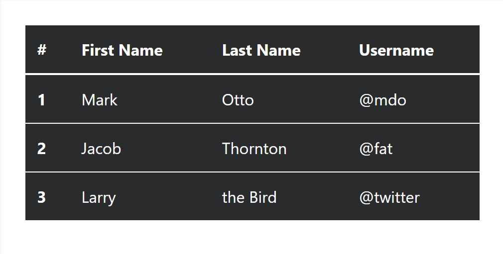
<table class="table table-inverse">
  <thead>
    <tr>
      <th>#</th>
      <th>First Name</th>
      <th>Last Name</th>
      <th>Username</th>
    </tr>
  </thead>
  <tbody>
    <tr>
      <th scope="row">1</th>
      <td>Mark</td>
      <td>Otto</td>
      <td>@mdo</td>
    </tr>
    <tr>
      <th scope="row">2</th>
      <td>Jacob</td>
      <td>Thornton</td>
      <td>@fat</td>
    </tr>
    <tr>
      <th scope="row">3</th>
      <td>Larry</td>
      <td>the Bird</td>
      <td>@twitter</td>
    </tr>
  </tbody>
</table>
Various other classes
For tables there are also some classes that help you to use several designs to a table ( read more), they are:
●
table-striped●
table-bordered●
table-hover●
table-condensedTo add these styles, simply add the wanted classes to the: <table>: <table class="table table-striped table-bordered table-condensed table-hover">
Table head possibilities
Much like default and inverted tables, apply one of two modifier classes to make
<thead>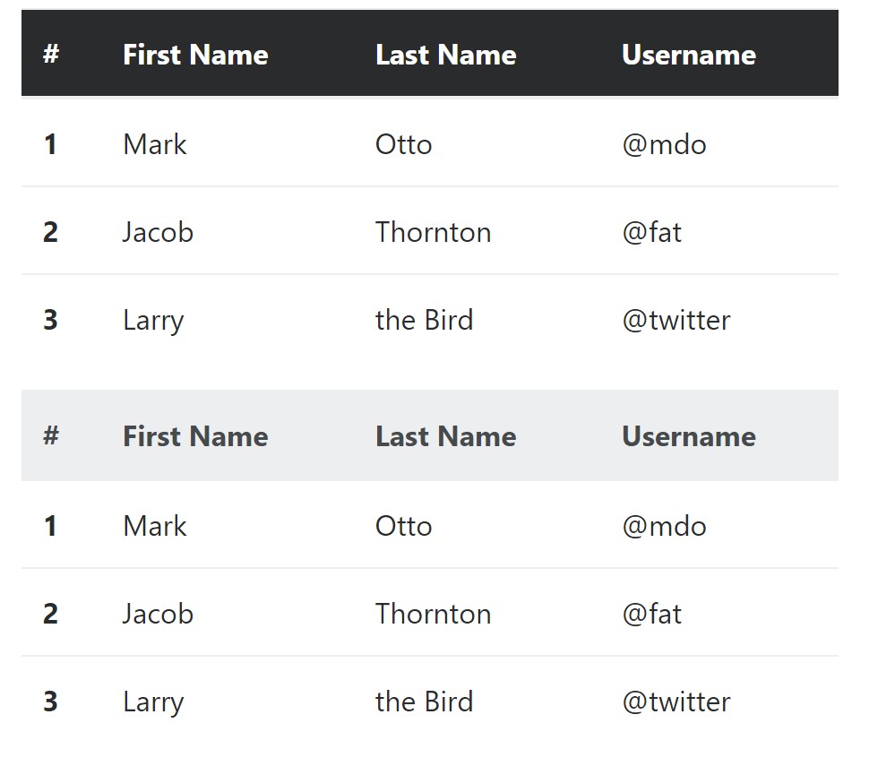
<table class="table">
  <thead class="thead-inverse">
    <tr>
      <th>#</th>
      <th>First Name</th>
      <th>Last Name</th>
      <th>Username</th>
    </tr>
  </thead>
  <tbody>
    <tr>
      <th scope="row">1</th>
      <td>Mark</td>
      <td>Otto</td>
      <td>@mdo</td>
    </tr>
    <tr>
      <th scope="row">2</th>
      <td>Jacob</td>
      <td>Thornton</td>
      <td>@fat</td>
    </tr>
    <tr>
      <th scope="row">3</th>
      <td>Larry</td>
      <td>the Bird</td>
      <td>@twitter</td>
    </tr>
  </tbody>
</table>

<table class="table">
  <thead class="thead-default">
    <tr>
      <th>#</th>
      <th>First Name</th>
      <th>Last Name</th>
      <th>Username</th>
    </tr>
  </thead>
  <tbody>
    <tr>
      <th scope="row">1</th>
      <td>Mark</td>
      <td>Otto</td>
      <td>@mdo</td>
    </tr>
    <tr>
      <th scope="row">2</th>
      <td>Jacob</td>
      <td>Thornton</td>
      <td>@fat</td>
    </tr>
    <tr>
      <th scope="row">3</th>
      <td>Larry</td>
      <td>the Bird</td>
      <td>@twitter</td>
    </tr>
  </tbody>
</table>
Striped rows
Zebra-like stripes can be added to with the
.table-striped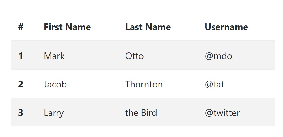
<table class="table table-striped">
  <thead>
    <tr>
      <th>#</th>
      <th>First Name</th>
      <th>Last Name</th>
      <th>Username</th>
    </tr>
  </thead>
  <tbody>
    <tr>
      <th scope="row">1</th>
      <td>Mark</td>
      <td>Otto</td>
      <td>@mdo</td>
    </tr>
    <tr>
      <th scope="row">2</th>
      <td>Jacob</td>
      <td>Thornton</td>
      <td>@fat</td>
    </tr>
    <tr>
      <th scope="row">3</th>
      <td>Larry</td>
      <td>the Bird</td>
      <td>@twitter</td>
    </tr>
  </tbody>
</table>
Hover Rows
To make a hover effect in the rows of your table add the
.table-hover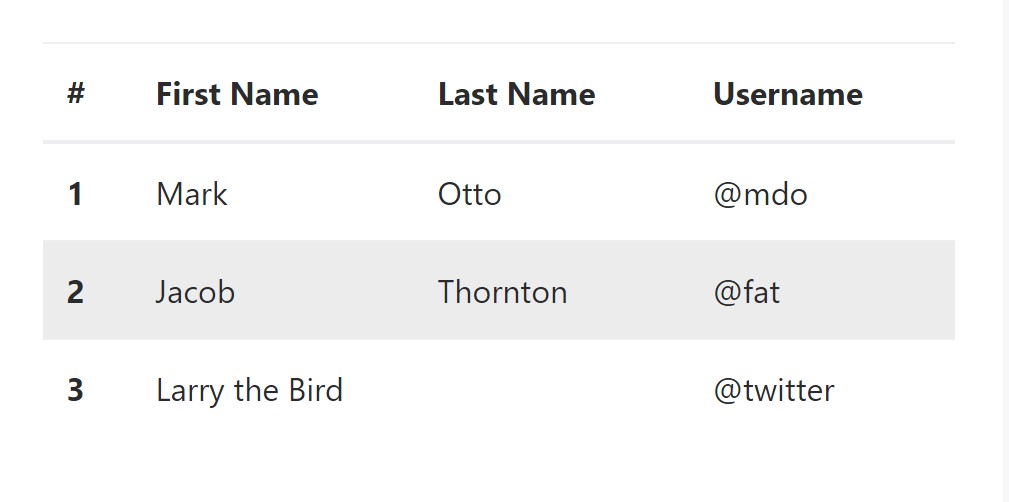
<table class="table table-hover">
  <thead>
    <tr>
      <th>#</th>
      <th>First Name</th>
      <th>Last Name</th>
      <th>Username</th>
    </tr>
  </thead>
  <tbody>
    <tr>
      <th scope="row">1</th>
      <td>Mark</td>
      <td>Otto</td>
      <td>@mdo</td>
    </tr>
    <tr>
      <th scope="row">2</th>
      <td>Jacob</td>
      <td>Thornton</td>
      <td>@fat</td>
    </tr>
    <tr>
      <th scope="row">3</th>
      <td colspan="2">Larry the Bird</td>
      <td>@twitter</td>
    </tr>
  </tbody>
</table>
Bordered Table
You can surely incorporate the borders on each table slide and a cell using the
.table-bordered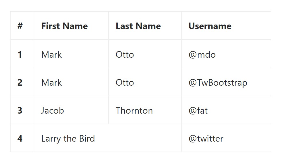
<table class="table table-bordered">
  <thead>
    <tr>
      <th>#</th>
      <th>First Name</th>
      <th>Last Name</th>
      <th>Username</th>
    </tr>
  </thead>
  <tbody>
    <tr>
      <th scope="row">1</th>
      <td>Mark</td>
      <td>Otto</td>
      <td>@mdo</td>
    </tr>
    <tr>
      <th scope="row">2</th>
      <td>Mark</td>
      <td>Otto</td>
      <td>@TwBootstrap</td>
    </tr>
    <tr>
      <th scope="row">3</th>
      <td>Jacob</td>
      <td>Thornton</td>
      <td>@fat</td>
    </tr>
    <tr>
      <th scope="row">4</th>
      <td colspan="2">Larry the Bird</td>
      <td>@twitter</td>
    </tr>
  </tbody>
</table>
Compressed Table
When you would like to make your table even more small - on that occasion you will be able to cut cell padding in half by having this class:
.table-condensedNote that, while Bootstrap 4 uses
.table-sm.table-condensed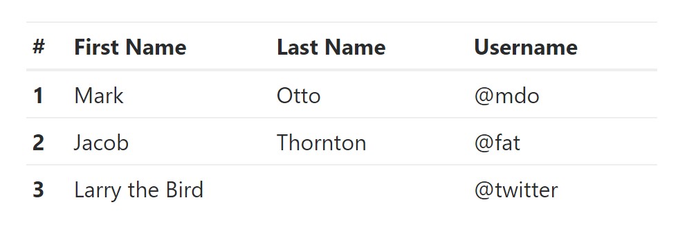
<table class="table table-sm">
  <thead>
    <tr>
      <th>#</th>
      <th>First Name</th>
      <th>Last Name</th>
      <th>Username</th>
    </tr>
  </thead>
  <tbody>
    <tr>
      <th scope="row">1</th>
      <td>Mark</td>
      <td>Otto</td>
      <td>@mdo</td>
    </tr>
    <tr>
      <th scope="row">2</th>
      <td>Jacob</td>
      <td>Thornton</td>
      <td>@fat</td>
    </tr>
    <tr>
      <th scope="row">3</th>
      <td colspan="2">Larry the Bird</td>
      <td>@twitter</td>
    </tr>
  </tbody>
</table>
Contextual Classes of Bootstrap Table Class
Use the contextual classes to color a table cells (
<td><tr>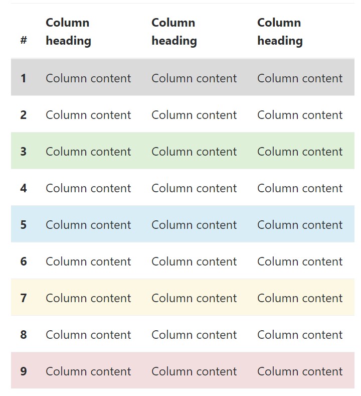
<!-- On rows -->
<tr class="table-active">...</tr>
<tr class="table-success">...</tr>
<tr class="table-warning">...</tr>
<tr class="table-danger">...</tr>
<tr class="table-info">...</tr>

<!-- On cells (`td` or `th`) -->
<tr>
  <td class="table-active">...</td>
  <td class="table-success">...</td>
  <td class="table-warning">...</td>
  <td class="table-danger">...</td>
  <td class="table-info">...</td>
</tr>
Changing the rows of a table Bootstrap 3 doesn't work with the
.table-.active.table-active● active: Adds the focus color to the table row or table cell
● success: Indicates a successful or positive action
● info: Signifies a neutral information change or action
● warning: Indicates a warning that you might need attention
● danger: Indicates a potentially negative or dangerous action
Responsive Tables
To create a responsive table - use the
.table-responsive
Bootstrap 4 allows you to add the
.table-responsiveCheck several online video short training about Bootstrap 4 tables
Connected topics:
Bootstrap Table Tutorial
__
W3schools:Bootstrap table tutorial
Bootstrap Tables Lecture